

The Titletown District now has its own logo. And its boring.
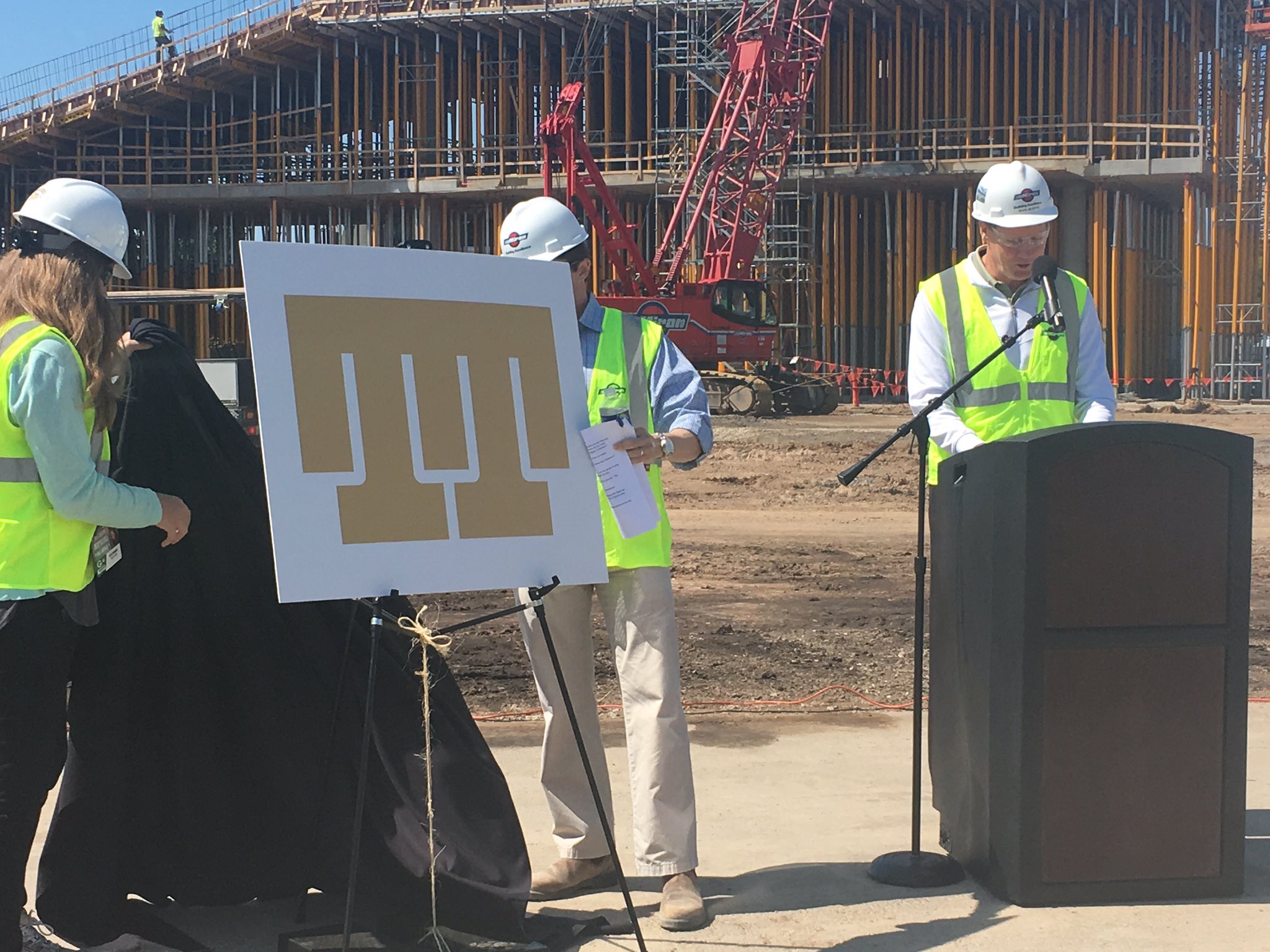


The Titletown District now has its own logo. And its boring.
Bud Adams told me the franchise he admired the most was the Kansas City Chiefs. Then he asked for more hookers and blow.

That's a corporate turd. I did notice there are two half goal posts. What sort of message does that send?Originally Posted by pbmax

"Never, never ever support a punk like mraynrand. Rather be as I am and feel real sympathy for his sickness." - Woodbuck
Here I thought they were just copying the sign on Ted's office door.


They should hire Skinbasket to redesign the logo. He could do something more interesting with those uprights.
don't encourage him. Of course, we don't know that he didn't submit a sample. The boring choice may have been overcompensation.
"Never, never ever support a punk like mraynrand. Rather be as I am and feel real sympathy for his sickness." - Woodbuck
 Posting Permissions

 Reply With Quote