 Tweet
Tweet
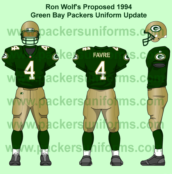
Best Packer Uni I've seen yet
|
Yeah I could go for that...
|
0%
|
2
|
|
|
no way you must be smokin!
|
0%
|
3
|
Comment